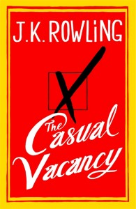
Welcome to my inaugural ‘uncovered’ post: a monthly meme in which I pick a book and unabashedly judge it by its cover.
I know you’re not supposed to, but lots of readers do it, and given how much time and money publishers put into their cover designs, they know we do it too!
I thought I’d kick today off with the cover of a much talked of book I bought very recently: J.K. Rowling’s adult novel The Casual Vacancy. See right, for it in all its glory.
Given how hyped the release of this book was, it’s safe to assume a fair bit of cover-judging went on with this one! In fact, the cover design’s release in July (two months before the book itself came out) even got its own news story!
Personally I was so put off by this cover, I doubt I would have bought it if it hadn’t been Rowling’s new book. (I am a diehard Potter fan and was very keen to read her latest offering. My review is here if you’re interested, by the by.)

Funnily enough, I think Rowling’s cover may have grown on me a little. I don’t hate it as much now as I did; maybe because I enjoyed the book. And I will say this for it – the gaudy red ‘n gold made it a book you don’t misplace in a hurry!
What do you think? Did this cover make you want to read the book, or did it turn you off?

I agree. I don’t think the cover really does the book much justice. The cover for THE CASUAL VACANCY isn’t half as elaborate as I thought it’d be, but nor is it simple enough to be classified as – well, simple. I don’t think I would have glanced twice if it had a different name on it.
And, YES! BITTER GREENS’ cover is amazing! One of the best designs I’ve seen. :) Comparing two of my favourite authors’ books’ covers…
Thanks for your comments Riley. Funny that we reacted to these two covers in the same way! As a Potter fan, are you planning to read (or have you already read) TCV?
~DF
I have read it, and I loved it. I do agree on all your points in your review, but I still loved it. I’m interested to see what she brings out next. :)
I too thought of a Big Mac when I first saw this cover, and my next thought was ‘commercialized’…
Agree! Did you read it anyway?
~DF
At first I very much disliked the cover. It looked just so old and boring and … I don’t know. Actually, I made a disgusted sound when I first saw it.
But now I kind of like it. No, I do like it – very much, to be honest! It’s not even because I liked the book so much (haven’t read it, yet), I just fell a little bit in love with it. And I have absolutely no idea how or why. xD
Thanks for your comments! That’s interesting that it grew on you so much! Are you planning to read the book?
~DF
I am; it’s already sitting on my shelf and one day … maybe when all the other unread books stop screaming for a moment. ;) But sooner or later I will. It’s JKR, after all.